Community
Father pleads guilty in death of 3-year-old son who shot himself in Eastlake apartment
By Michelle Rivera
Advertisement · Why this ad?
Michelle, an Ohio State University graduate, has spent over six years focusing on community issues in Cleveland, including social justice and local initiatives. She has previously written for NPR's local affiliates, where she honed her storytelling skills to highlight diverse community voices.
More from Michelle →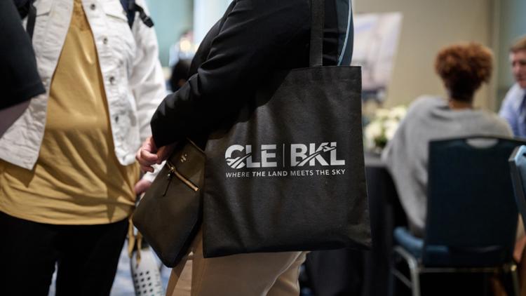
On a bright morning at Cleveland Hopkins International Airport, a small crowd gathered near the terminal, their eyes drawn to a sleek new logo projected onto a large screen. Among them was Lisa Carter, a lifelong Cleveland resident and frequent traveler, who paused to admire the fresh design. "It’s a beautiful tribute to our city’s natural beauty," she said, her face lighting up with pride. This moment marked more than just a rebranding; it was a celebration of Cleveland’s identity and its connection to the land and sky that surround it.
Earlier this week, Cleveland’s two major airports—Cleveland Hopkins International Airport and Burke Lakefront Airport—unveiled new logos and a shared tagline that encapsulate the spirit of Northeast Ohio. The refreshed identities feature sleek, modern designs inspired by the region’s landscape, including the rolling hills, lakes, and expansive skies that define the area. The new branding aims to foster a stronger sense of community pride and highlight Cleveland’s unique geographical beauty.
The logos, which will gradually appear across signage, digital platforms, and promotional materials, symbolize a fresh chapter for Cleveland’s transportation gateways. Cleveland Hopkins, the larger of the two, retains its iconic elements but with a contemporary twist, emphasizing movement and progress. Meanwhile, Burke Lakefront’s new identity underscores its role as a scenic, accessible gateway to the city’s waterfront and downtown.
Central to the rebranding is the evocative tagline, “Where the Land Meets the Sky,” which captures the essence of Cleveland’s landscape. It reflects the city’s proximity to Lake Erie, the surrounding hills, and the expansive Ohio plains. Officials hope this phrase will resonate with travelers and locals alike, fostering a sense of belonging and pride in the region’s natural beauty.
"This isn’t just about logos; it’s about telling Cleveland’s story visually and emotionally," said Mark Johnson, director of Cleveland’s Department of Aviation. "Our airports are gateways to our community, and these new images will help us showcase what makes our city special."
The response from residents has been overwhelmingly positive. Many see the new branding as a reflection of Cleveland’s resilience and natural charm. Sarah Miller, a local business owner, shared her thoughts: “It’s inspiring to see our city embrace its roots and look forward with a fresh perspective. It’s a reminder of our strength and beauty.”
Travelers passing through Hopkins and Burke airports expressed curiosity and excitement about the new logos. Visitors often comment on how Cleveland’s natural scenery, from Lake Erie to the nearby Cuyahoga Valley, shapes the city’s identity. The branding efforts aim to deepen that connection, making travelers feel more at home and proud of their city’s heritage.
Beyond aesthetics, the rebranding is part of a broader initiative to boost community pride and economic development. Cleveland’s airport authorities are working with local artists and designers to ensure the new logos reflect authentic regional elements. The effort also aligns with city initiatives to promote tourism, attract new business, and celebrate Cleveland’s rich history.
Many local organizations and civic leaders see this as an opportunity to unite residents around a shared identity rooted in natural beauty and resilience. “When people see themselves reflected in the symbols of their city, it fosters a sense of ownership and pride,” said Pastor James Lee of First Baptist Cleveland. “It reminds us of the importance of strong families and communities built on faith and commitment.”
This rebranding effort extends beyond mere visuals; it reflects Cleveland’s larger aspirations to foster a sense of unity and pride amid ongoing economic and social challenges. Historically, Cleveland has faced economic downturns, especially with the decline of manufacturing industries in the late 20th century. Yet, the city has demonstrated resilience through revitalization efforts, cultural renaissance, and community activism.
The new logos and tagline serve as a visual reminder of that resilience, emphasizing a shared identity rooted in the land’s natural beauty and the sky’s limitless potential. For residents, it’s a source of pride and a symbol of hope for future growth. For visitors, it offers a welcoming message that Cleveland is a city proud of its heritage and looking forward.
Local leaders believe that branding can influence perceptions, both internally and externally. Mayor Justin Bibb, in a statement, highlighted how the new identity aligns with the city’s broader goals: “We want Cleveland to be seen as a vibrant, innovative, and connected community. These new symbols reinforce our commitment to growth and our appreciation for the natural environment that makes Cleveland unique.”
The phased rollout of the new branding will begin immediately, with signage updates at both airports scheduled over the next few months. Digital platforms and promotional materials will follow, creating a cohesive visual identity for Cleveland’s gateways to the world. Officials also plan to host community events to celebrate the new branding and engage residents in sharing their stories of Cleveland’s natural beauty.
As Cleveland continues to grow and evolve, the new logos serve as a visual reminder of the city’s enduring connection to its land and sky. The hope is that travelers and residents alike will carry this renewed sense of identity wherever they go, fostering pride and unity across the region.
Looking ahead, Cleveland’s airports are committed to reflecting the city’s authentic spirit—grounded in faith, family, and community—while reaching for new heights. The simple yet powerful message of “Where the Land Meets the Sky” promises to inspire all who pass through these gateways, reminding us of the beauty and resilience that define Cleveland.
Beyond the logo unveiling, Cleveland’s airport authorities are planning ongoing community engagement initiatives to deepen the connection between the city and its transportation hubs. These include art installations, storytelling events, and local history exhibits that highlight Cleveland’s rich cultural tapestry. The goal is to make the airports not just transit points but vibrant spaces that celebrate local identity.
Furthermore, the city is exploring partnerships with local schools and universities to incorporate the new branding into educational programs. Students from Cleveland State University and Case Western Reserve University are being invited to participate in design contests and community projects that promote civic pride. This initiative aims to foster a sense of ownership and creativity among the city’s youth, ensuring the new identity endures for generations to come.
The impact of this rebranding extends into regional development efforts. Cleveland’s leaders see the logos and tagline as part of a larger strategy to attract tourism, business investment, and talent to the area. The region’s natural assets—such as Lake Erie and the Cuyahoga Valley National Park—are being promoted more prominently in marketing campaigns, aligning with the new visual identity.
Local businesses are also optimistic. The Cleveland Chamber of Commerce has announced initiatives to leverage the new branding in marketing efforts, aiming to boost local commerce and create new jobs. The hope is that a unified visual identity will help Cleveland stand out in a competitive national and international landscape.
As the new branding takes hold, city officials emphasize the importance of maintaining momentum through continuous community involvement and strategic marketing. They plan to monitor the impact of the rebranding on tourism numbers, economic growth, and community engagement, adjusting their strategies as needed. Feedback from residents and visitors will be crucial in refining the messaging and ensuring it resonates broadly.
Moreover, Cleveland’s leadership is committed to ensuring that the symbolism behind the logos and tagline remains relevant and inspiring. This includes annual celebrations, updated educational materials, and ongoing collaborations with artists and community groups. The goal is to embed this new identity into the fabric of Cleveland’s future, making it a lasting emblem of the city’s resilience and natural beauty.
By Michelle Rivera
By Michelle Rivera

By Michelle Rivera

By Michelle Rivera